Loading...
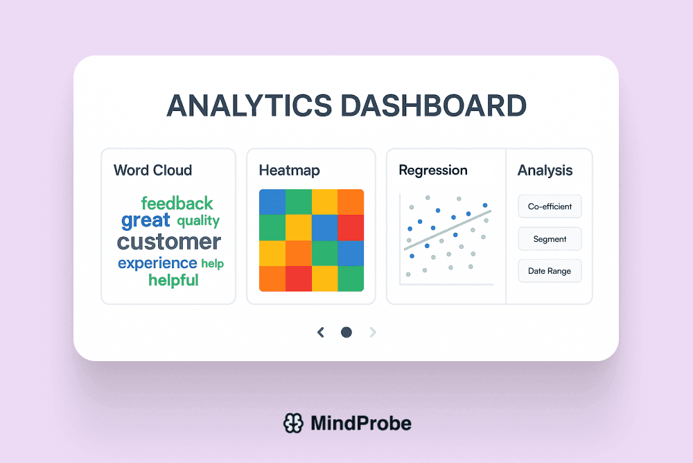
Unlock Deep Insights with Advanced Analytics
Analyze your survey data with specialized modules word clouds, heatmaps, statistical analyses, and more no coding required.
Go beyond basic charts use word clouds, heatmaps, and statistical models to uncover deeper meaning without coding.
Unlock Deep Insights with Advanced Analytics
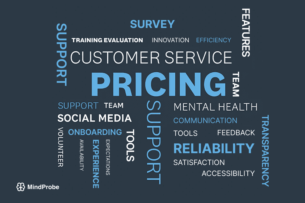
Word Clouds for Open-Ended Responses
Transform hundreds of verbatim comments into visual word clouds that highlight the most frequent terms and emerging themes. Instantly filter by sentiment or demographic to see how language shifts across segments.
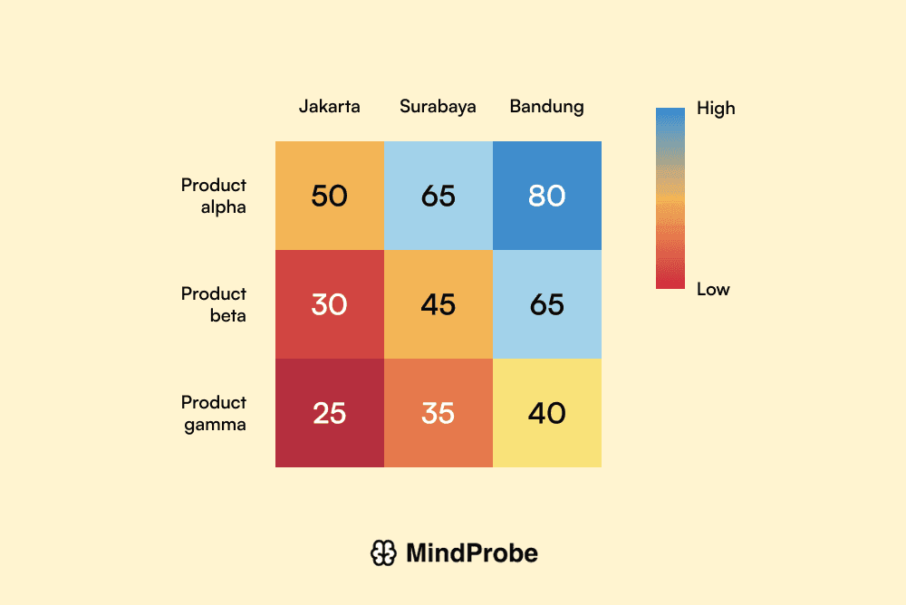
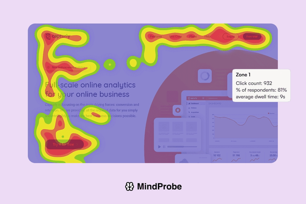
Matrix Heatmap Visualization
Plot response intensity across two variables e.g., satisfaction vs. feature usage using color-graded matrices. Spot hotspots of engagement or dissatisfaction at a glance.
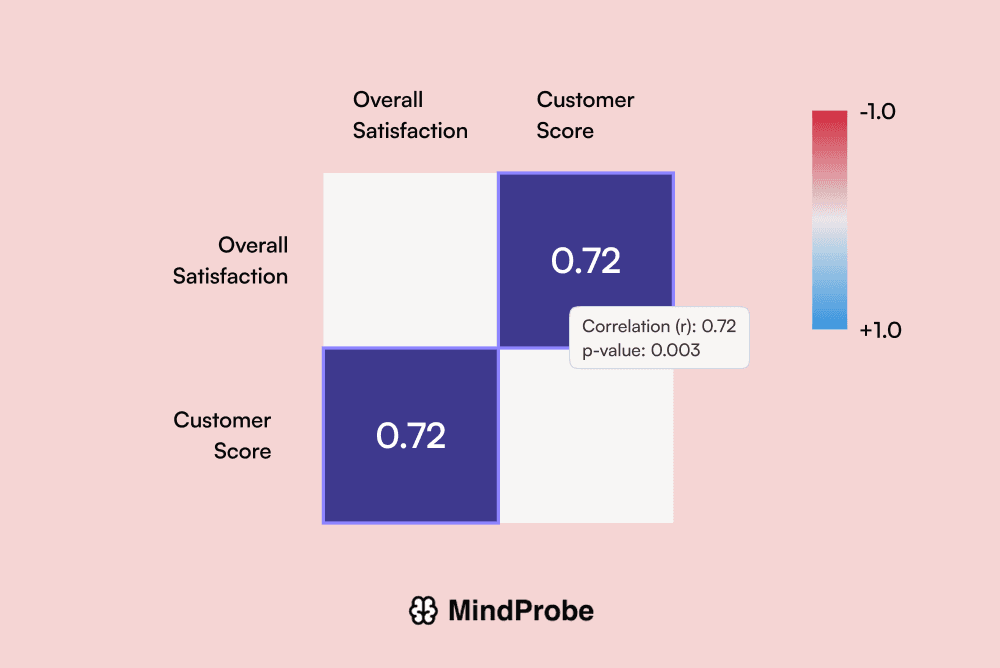
Correlation & Statistical Analysis
Identify relationships between numeric survey metrics such as NPS score vs. time-on-site via scatter plots, regression lines, and p-value indicators. Drill into significant correlations with one click.
Hotspot Analysis
Map high-impact survey segments on geographic or persona heatmaps to pinpoint where to prioritize action.
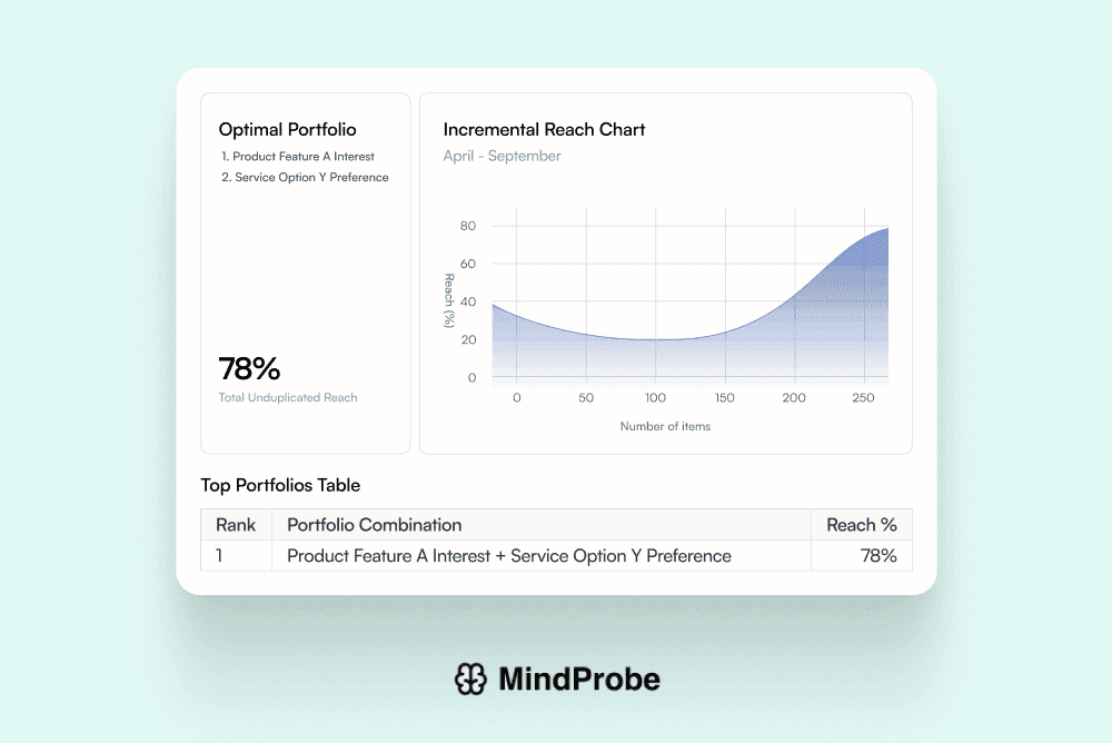
TURF Reach Analysis
Determine the optimal combination of features or messages that maximize overall reach and adoption.
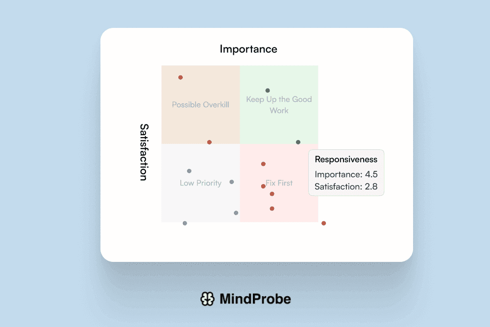
GAP Analysis
Calculate the difference between current and desired scores across attributes to identify critical improvement areas.
Ready to dive deeper into your data and drive smarter decisions?
Join thousands of companies already using MindProbe to gather valuable insights.